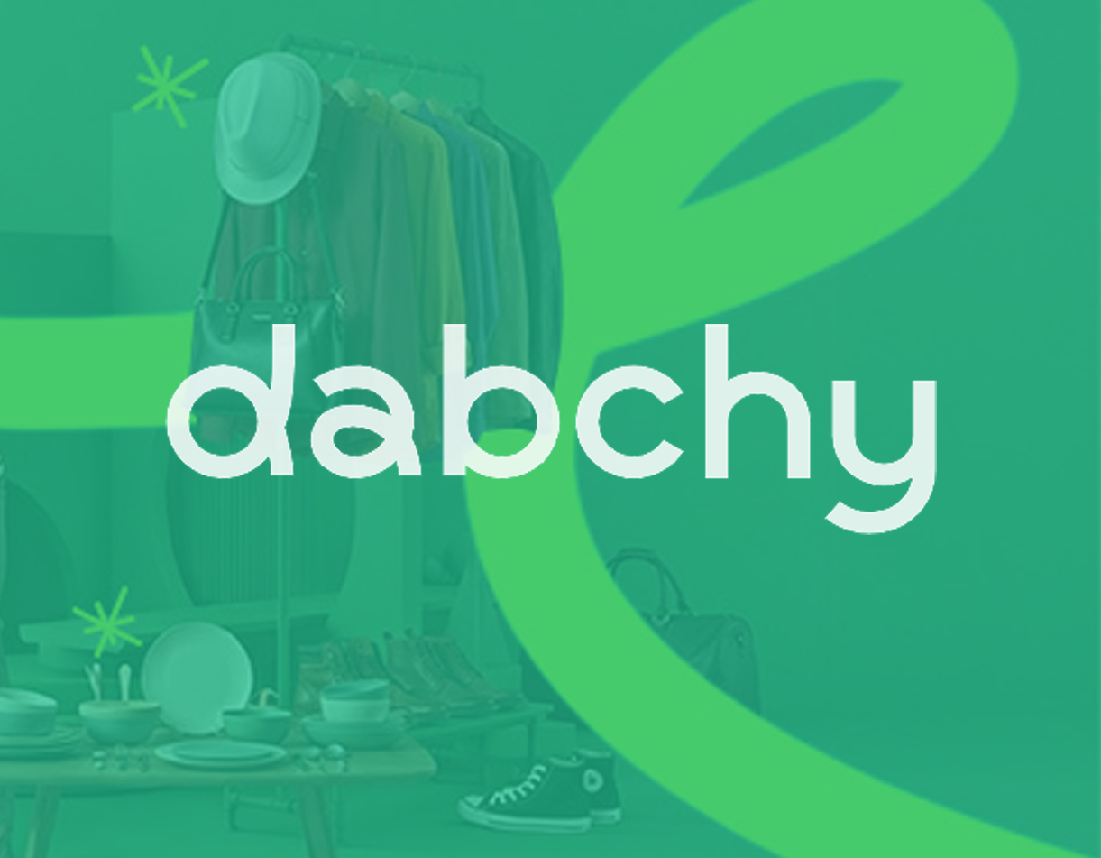
ABOUT
Founded in 2016 by Ameni Mansouri, Ghazi Ketata, and Oussama Mahjoub, Dabchy has grown into one of the leading circular fashion and social commerce platforms in the Middle East and North Africa. By blending marketplace technology with social interaction, Dabchy enables people to buy and sell pre-owned fashion through a seamless, secure, and community-driven experience.
With over a million users and millions of listed items, the platform promotes a more sustainable and accessible approach to fashion by extending the life cycle of clothing. Today, Dabchy continues to evolve beyond women’s fashion into broader lifestyle categories, reinforcing its vision of building a dynamic, inclusive, and future-ready fashion ecosystem.
CHALLENGE
Dabchy redefined how people experience fashion by transforming wardrobes into marketplaces and building one of the region’s most trusted circular fashion communities. However, as the platform expanded, its visual identity remained rooted in its early beginnings — closely tied to a single category and no longer reflecting the scale, diversity, and ambition the brand had achieved.
What began as a women-focused resale platform evolved into something much greater: a dynamic social marketplace shaped by fashion, community, and circular living. The challenge was to express inclusivity, movement, and modernity while preserving the emotional connection and brand recognition built over the years — creating an identity as alive and evolving as the platform itself.
THE CONCEPT
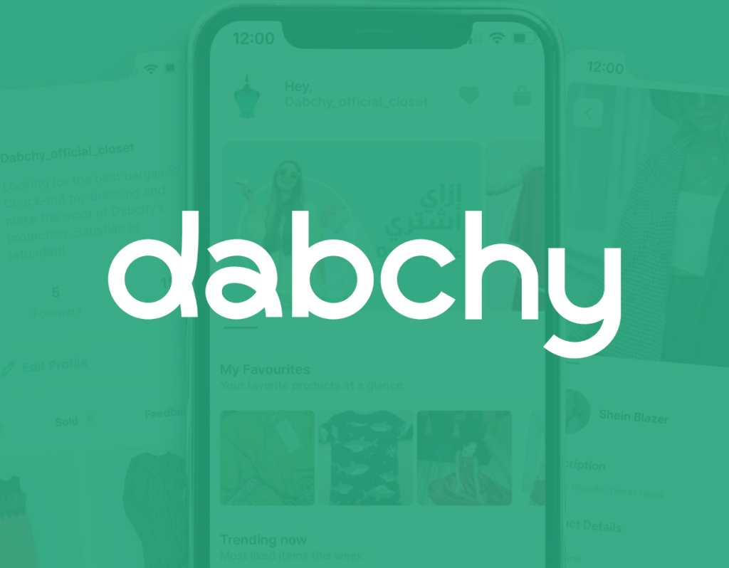
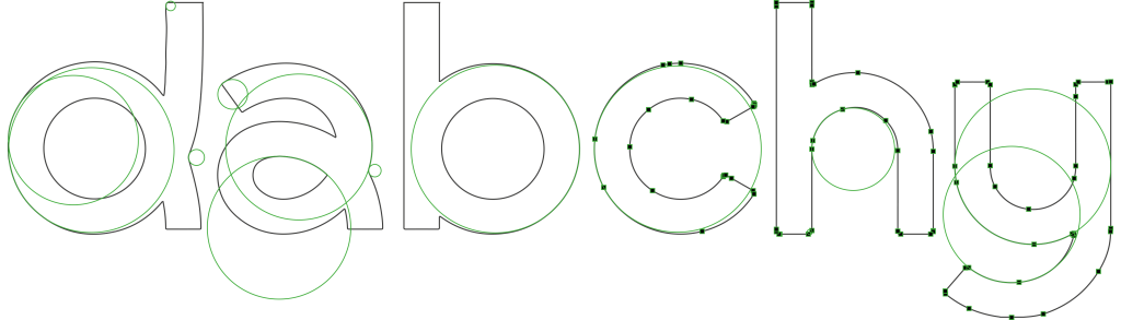
Connection lies at the heart of Dabchy — a continuous flow between people, fashion, and stories. The new identity was designed to reflect this movement: fluid, inclusive, and dynamic.
The letter “D” became the central symbol, not only as an initial but as a living form representing connection, circulation, and exchange. Its shape conveys motion and flexibility, echoing the circular life of fashion and the seamless interaction between vendors and buyers.
The visual language is clean, modern, and human — elegant yet simple, digital yet warm — built to scale across product, platform, and community. From logo to interface and brand communication, every element reflects a living ecosystem where fashion moves, evolves, and lives more than once.